Tuesday, 10 May 2016

Mail Art | Krisy Podolak

Hi, it's my turn to share today.  I recently got my hands on the new paint.  I was so excited to get them and could not wait.  But wait I did. A lot longer than was really necessary thanks to our postal system.  The whole delivery process found my paints end up at completely the wrong house and missing for a few days before thankfully the recipient phoned the number on the parcel to say they had it.  I raced to pick them up only to fall ill and the paints just sat for a few more days.

Then one morning I woke up and my Bloglovin feed gave me some inspiration in the form of Fiona Paltridge.  Fiona is my ultimate Scrappy Girl Crush.  I love her work and she is pretty awesome in real life also.  I was recently lucky enough to attend one of Fiona's workshops and my Girl Crush for her has grown.  So when her Poppy blog post came up I knew I was going to Scraplift/Steal it as soon as I saw it.


The same day all this happened I had a Masters Challenge for Scrapbooking Memories due in the next few days.  I really struggled with this piece as the colours and the "theme" of the pack was so totally not me. And as Neet says "No amount of Gesso was going to help", so once I muddle through it and managed to produce a layout that actually turned out pretty awesome, it was time to prepare my Pizza Box.

For those who don't know, when you have a submission accepted for Scrapbooking Memories Magazine there is an extra challenge to decorate your Pizza box for submission.   You can read about it here on one of my blog posts.  I decided to crack out my Flutterby paints for this one.  I totally stole like an artist and created a box with Fiona inspired Poppies.  These are so beautiful and easy to do.  So easy in fact, that my three year old daughter, Poppy helped me.  She still finds it amusing that there is a Poppy flower just like her name.


I watered the paints down a bit to create water colour washes for this and used my heat gun to move the colour around while it was drying.  I used a mister sprayer to add more water to the colours once they were on the box to make it more fluid.  There wasn't the right green but I just mixed up my own.  That's the beauty of primary colours and having a whole set of colours.  I did ask Neet when these colours were released if I could buy just certain ones.  Her words were along the lines..."you'll need the whole set" I didn't need the convincing I was just concerned I would use some colours more than other.  But as it turned out I did need the set. So, its just as well I had the whole set.  If you haven't got your hands on these little babies yet, I highly recommend you do.  They are a great consistency but with excellent coverage and are so versatile.  Plus the packaging is just the right size to hold in your hand.


There isn't a process video for this project as my camera was downloading while we worked on this box but let me know if you would like to see one and I will see what I can do sometime in the future. So, keep an eye out for this one doing the rounds on the Great Mailart Pizza box hunt.  I can't wait to see what others add to it.

Friday, 6 May 2016

Morning Snuggles by Lauren Hender

I love these photos.. not overly fluttering but who is first thing in the morning when your babies come and jump on you. These are the everyday moments I wish always to remember and treasure.

In this layout I have used lots of Flutterby goodies. In the background I have use a stencil and some texture paste. I have added the cutest wood veneer typewriter, a brightly perfect flair, some enamel dots and a photo tab.

All these perfect accents highlight my layout and make this moment appear as magical as it was.

I hope this layout inspires you to capture your everyday moments.

Lauren xo


Wednesday, 4 May 2016

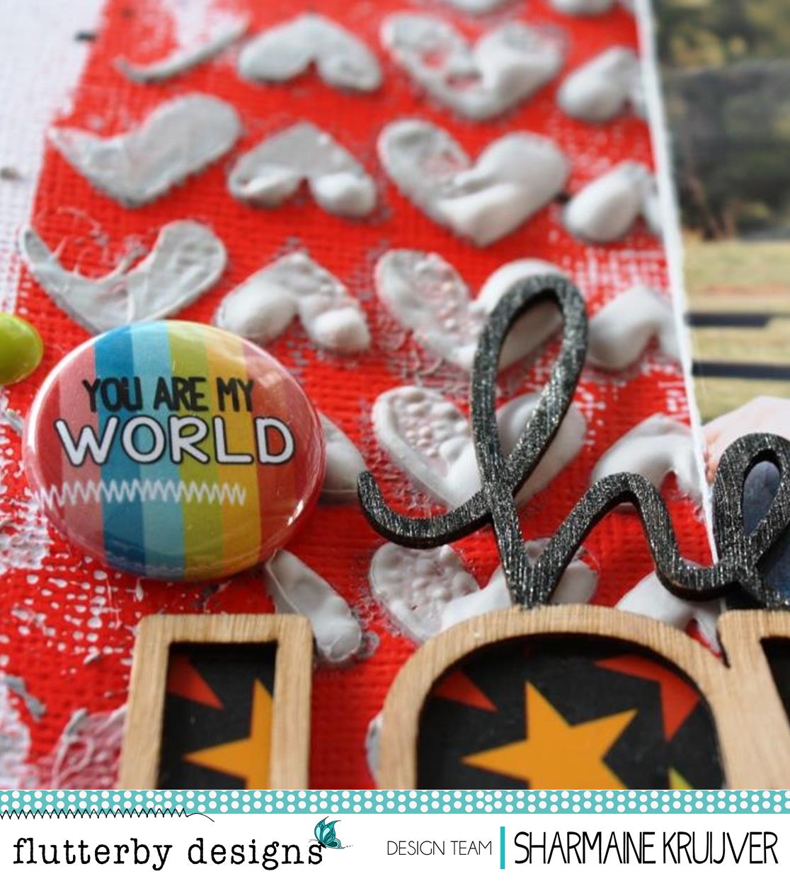
"No Other Way" By Sharmaine Kruijver

Hello Flutterheads
It snowed on the mountain here in Hobart today!!
Our Indian Summer seems to finally be over.
With the cold weather comes dark, gloomy days.
So I made a page that is full of colour
And I hope it adds some cheer to your day.
 
Love the spots of colour that a Flutterby Page Tab can add


Mixed in some foil flair


And some other Flutterby flair

 
I backed this cool "wood bit" with a Everyday Etc Card
And I think  the results were A-OK!!

OH OH OH
And speaking of A-OK....
Have you seen the sneak peeks Anita has been showing on Facebook?!
Very exciting!


Sunday, 1 May 2016

Everyday by Kylie Cornish

Happy May people!

I love capturing those rare family moments when we are all together. 
Being a family of 6 and also a family of working and socialising teenagers its not that often we are all together.
But thanks to the long Easter weekend last month we had that rare but special family time and took a day trip to 
Mt Field National Park. 


It started off with a funny and noisy 1 hour drive.


Then a 3 1/2 hour walk to see all the beautiful waterfalls and the amazing tall trees of our untouched forest. 


A picnic lunch to feed the starving troops. "Came with heaps of food and left with nothing but empty containers".


A game of " Chubby Bunny" with popcorn and laughter with tears.

A day filled with the most amazing memories, photo's to cherish
 and maybe a few aching feet, 

Products Used Linked Below -


Thanks for letting me share one of our rare all together family moments.
Happy creating!

Friday, 29 April 2016

April Guest Designer - Paula Perry 'Hello Love'

Paula is back with another creation using the 'Wild Bohemian' Everyday Etc card pack.
Loving all the movement in this layout!

'HELLO LOVE'

Paula was drawn to the circular design of the wood veneer so she created lots of circles with the 'Wild Bohemian' photo cards...it's such a fun & vibrant pack, so she had to use some silly photos of her daughter to match. 


There's one more creation of Paula's to come - so stay tuned!!

Wednesday, 27 April 2016

HEARTBREAK - An Art Journal Page | Krisy Podolak

Art Journalling can be a way of keeping a diary if your not a writer.  I am not really a writer. I much prefer to "make" visual things.  If you've read Elizabeth Gilberts "Big Magic", you will know she talks about being creative as a range of different things but all "creative" things release something from the soul that may or may not appeal to everyone and more often than not won't. I have a feeling that the Art Journal page I am sharing today may be one of those things that divides us but I don't care.  Make of it what you like and feel free to leave me your thoughts I'd love to hear them.

This layout I have titled "Heartbreak"  I am fortunate enough not to have experienced this recently however I am sure at some point EVERYONE had had this feeling show up on their doorstep.  I have reconnected with an old friend recently who has recently experienced heart break but has found her new self amongst all the mess that it causes.  This page could be seen as a mess, it could be seen as creative or it could very well be seen as rubbish to some but that's what an Art Journal is all about.  Its thoughts, emotions and stories that you interpret and read your own way.  This is my interpretation of "Heartbreak" especially my dear friends.


Love is full of lumps and bumps.  It can be messy. And almost always after it ends its a freaking huge mess.  There is always good memories and bad associated with the whole process.  When you look back on it after you have had time to heal and you are happy again -  you are left with memories and feelings that are very different to what you experienced at the time.  You get stronger, you learn, you move one, you let go, you even  hate a little less or even a little more.  At the end of the day there is a lot that goes into love and ending it.

I wanted this page to be a reflection of that Love breakdown process.  First, I had to create love - for me this is a whole lot of layers.  To start I used home made texture paste (there will soon be a process video up on the Popleopod YouTube channel on how to make it) and torn book pages to create a life and story.  Then I added love over the top - Texture paste through the Flutterbys Heart stencil. That was my base finished. I then created the "Heartbreak" mess over the top.  I used the New Flutter Colour paint in Red and Orange both applied with a brush and drizzled straight from the bottle. This stuff is such a great consistancy and has great coverage in just one coat.


Over the top of the background I added some doodles with sharpie pen to represent all the realisations after the fact.  I added some black drawing ink to represent the darkness that threatens to take over and some Splatter of Gold Colour Shine to reflect the light at the end of the tunnel.  As this page is my interpretation of my darling friend, I added some glitter gold texture paste to one of the hearts...She has a heart of gold which I wanted to depict on my page.  I added the words - "Heartbreak: what is it exactly?"that I cut from a magazine.  Heartbreak can be interepreted differently as can my page.


That's it.  Thats my share for today.  What do you think?  Is it art? or just a Mess trying to pass as Art?

You can watch me put it together in a process video on my YouTube Channel Popleopod.  Don't forget to let me know what you think.